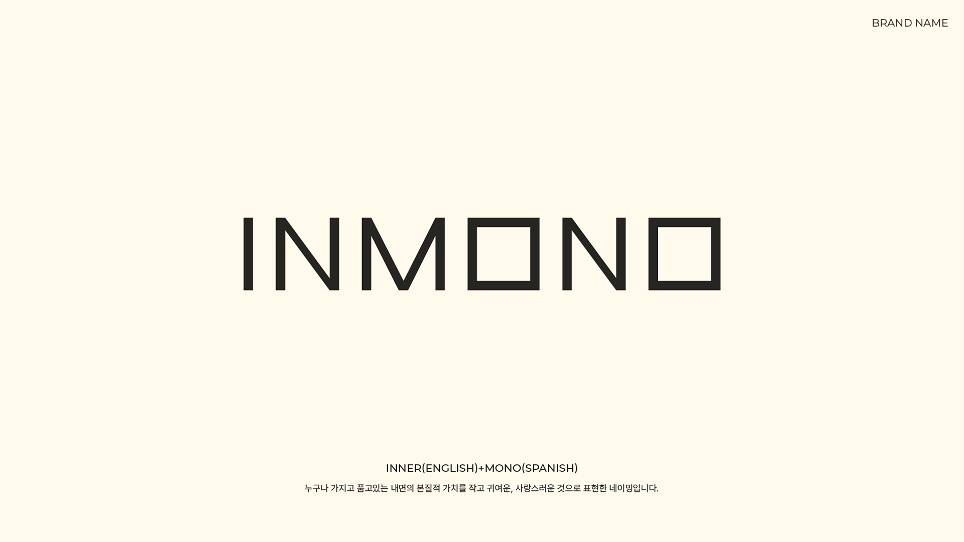
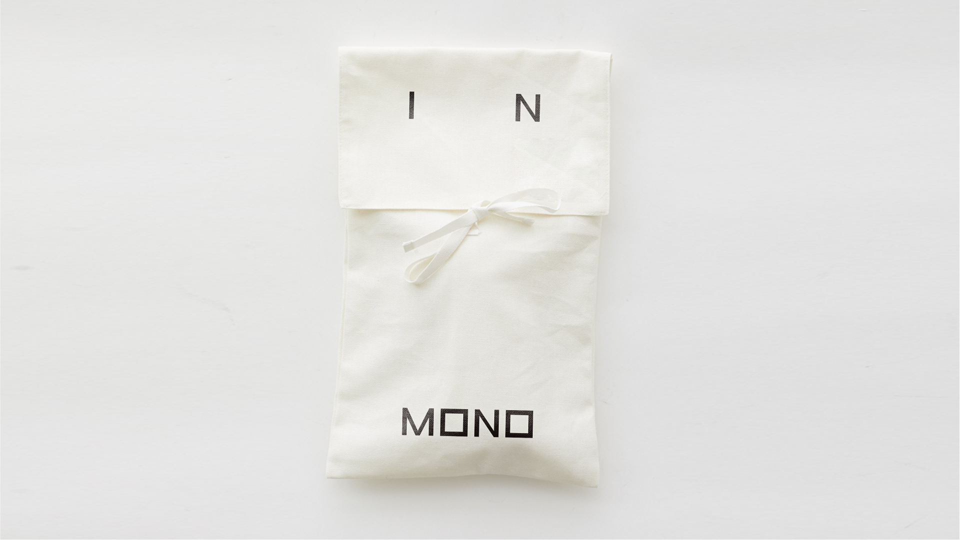
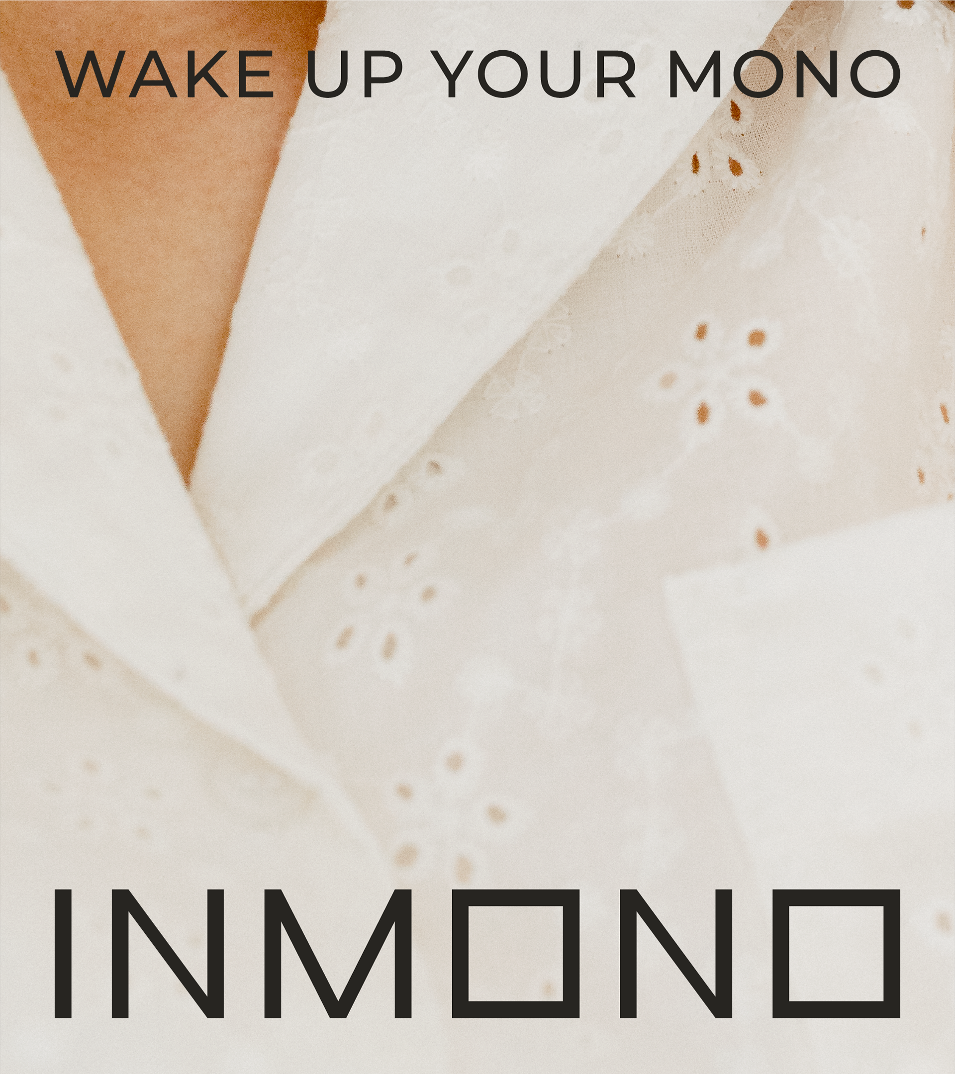
Slogan
내 안에 있는 작은 욕망들 작고 귀여운 소망들을 깨워 마음껏 발산하고
그것을 INMONO가 함께 한다는 의미를 담은 슬로건입니다.
그것을 INMONO가 함께 한다는 의미를 담은 슬로건입니다.
It is a slogan that contains the meaning of waking up the small desires and cute little wishes within me to shine freely,and that Inmono will do the work together.

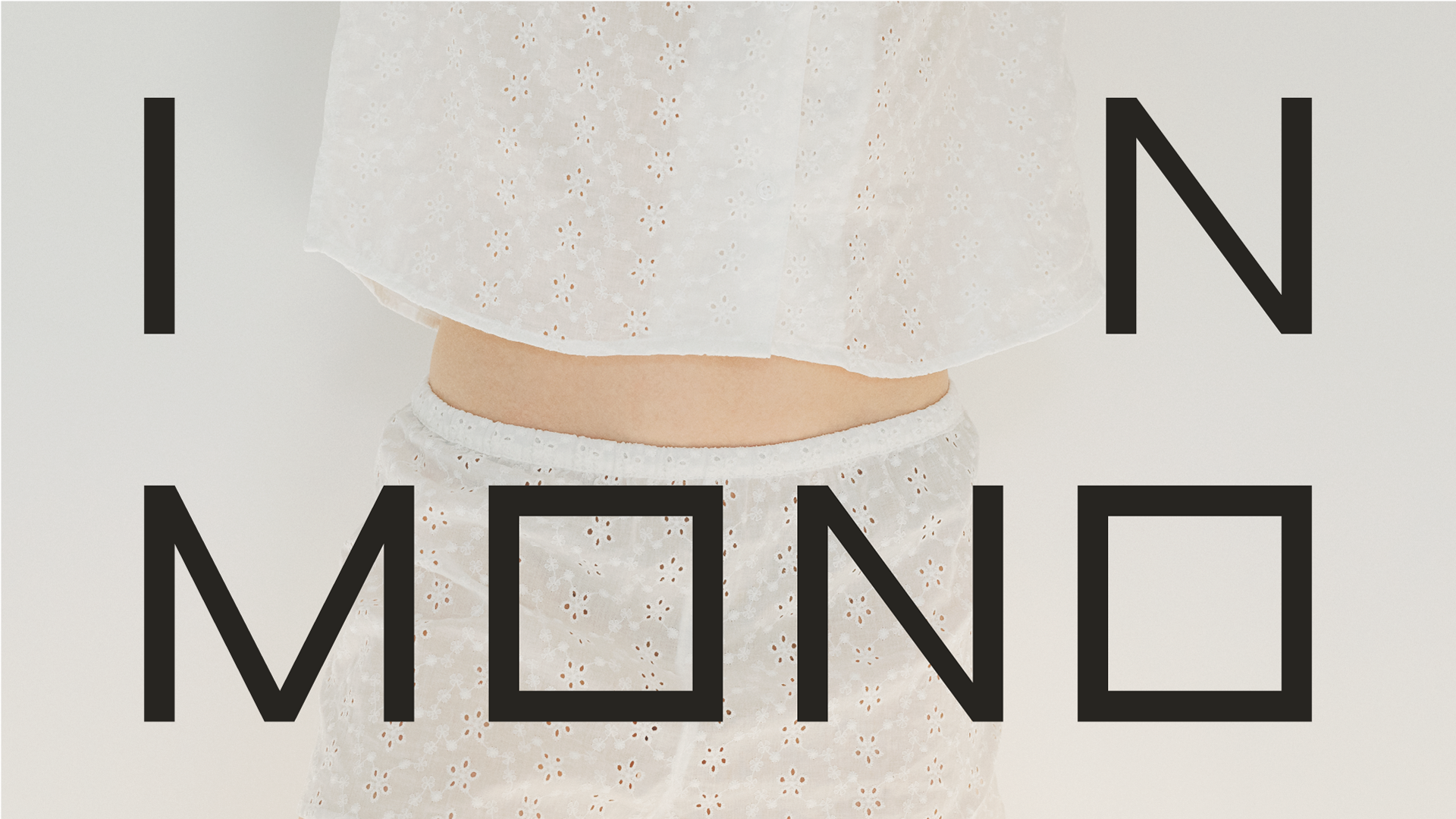
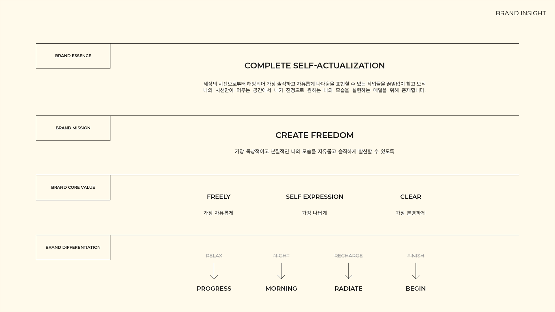
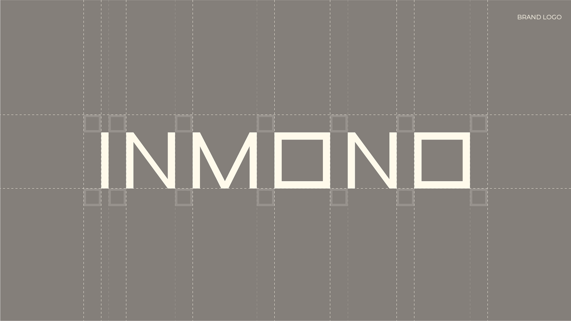
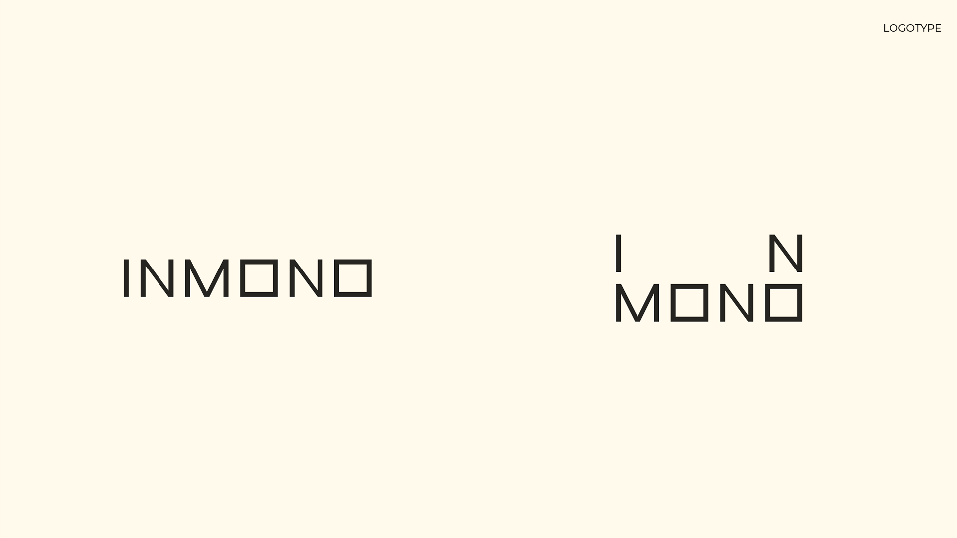
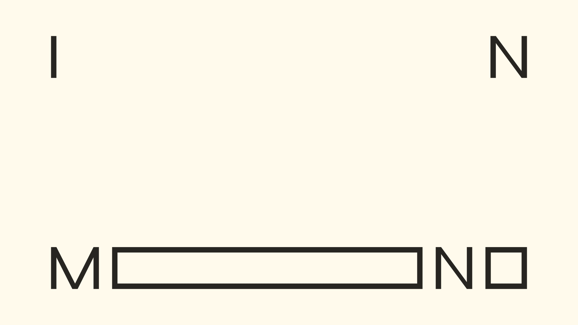
DESIGN MOTIF
my own frame
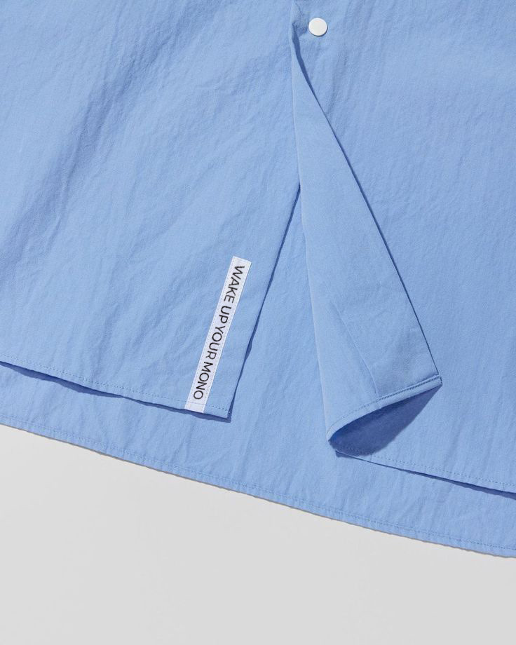
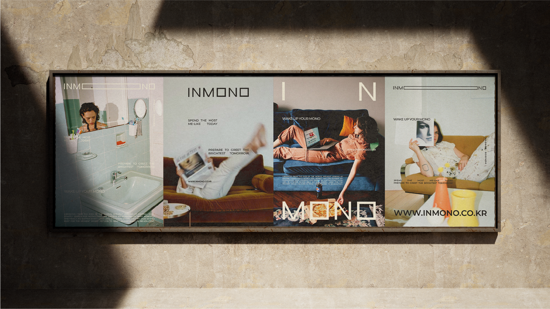
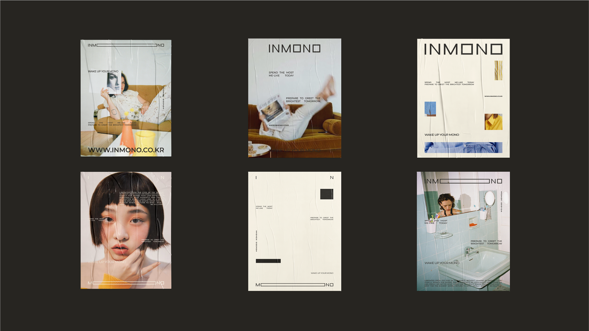
자유로움과 솔직함으로 고유함을 빛내고자 하는 INMONO에게 세상의 기준은 자기 표현을 가두는 틀이었습니다. INMONO는 일상을 마치고 돌아가 오롯 혼자인 시공간을 쉼과 휴식이 아닌 가치를 발산하고 표현하는 작업의 시작으로 다시 규정하였고 세상의 틀이 아닌 각자의 기준과 형식을 갖춘 견고한 틀을 만들어가는 사람들의 이야기를 담는 과정에서 우리가 이미 무수히 많은 사각의 물질들을 이용해 각자의 개성과 취향을 채우고 표현하고 있다는 것에서 자유로움과 고유함을 인지할 수 있었습니다. 우리는 사각형과 프레임이 가지고 있는 보편적인 관념을 INMONO만의 방식으로 풀어내어 세상의 시선에서 벗어난 해방의 공간, 나의 무드를 형용하는 보드, 내가 간직하고자 하는 한 장면들이며 유일함을 상징하는 견고한 자유로움으로 다시 정의하였습니다. 자유로운 형태의 사각형 즉 각자의 고유함을 우리만의 방식으로 형용하고 배열함으로써 다양한 개성을 포용하는 브랜드라는 가치를 담고 있습니다.
For Inmono, who wants to shine his own uniqueness with freedom and honesty, the standard of the world was a frame that confines self-expression. Inmono redefines the time and space of being alone at the end of daily life as the beginning of work that emits and expresses values rather than rest and relaxation. In the process of collecting stories of people who are making a solid frame with their own standards and formats, not the world's frame, I could feel that they are already filling and expressing our personality and taste with countless square materials. The universal concept of rectangle and frame has been redefined in Inmono's own way as a space of liberation away from the world's gaze, a board to express one's feelings, a scene to be cherished, and solid freedom that symbolizes uniqueness. We expressed and arranged each person's individuality in our own way in a free-form square, embodying the brand value of embracing various personalities.
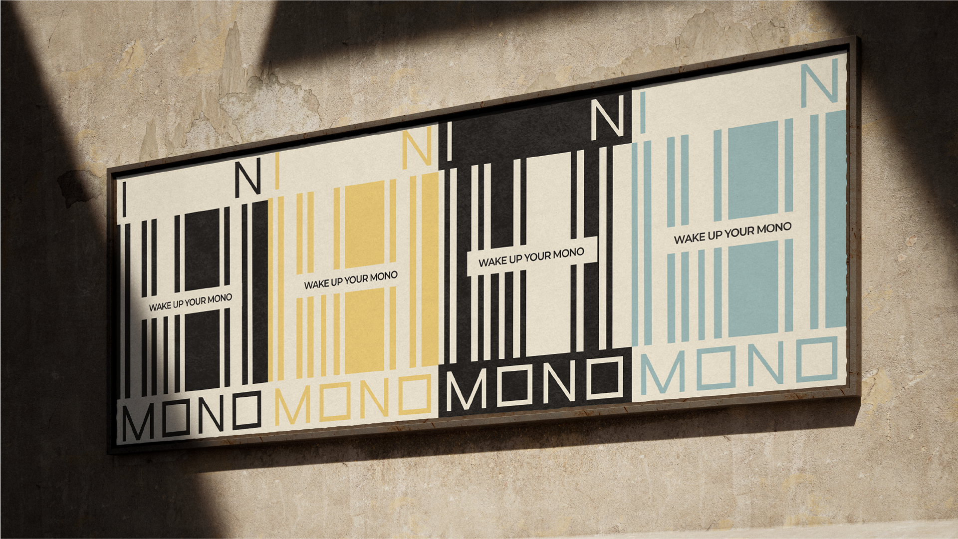
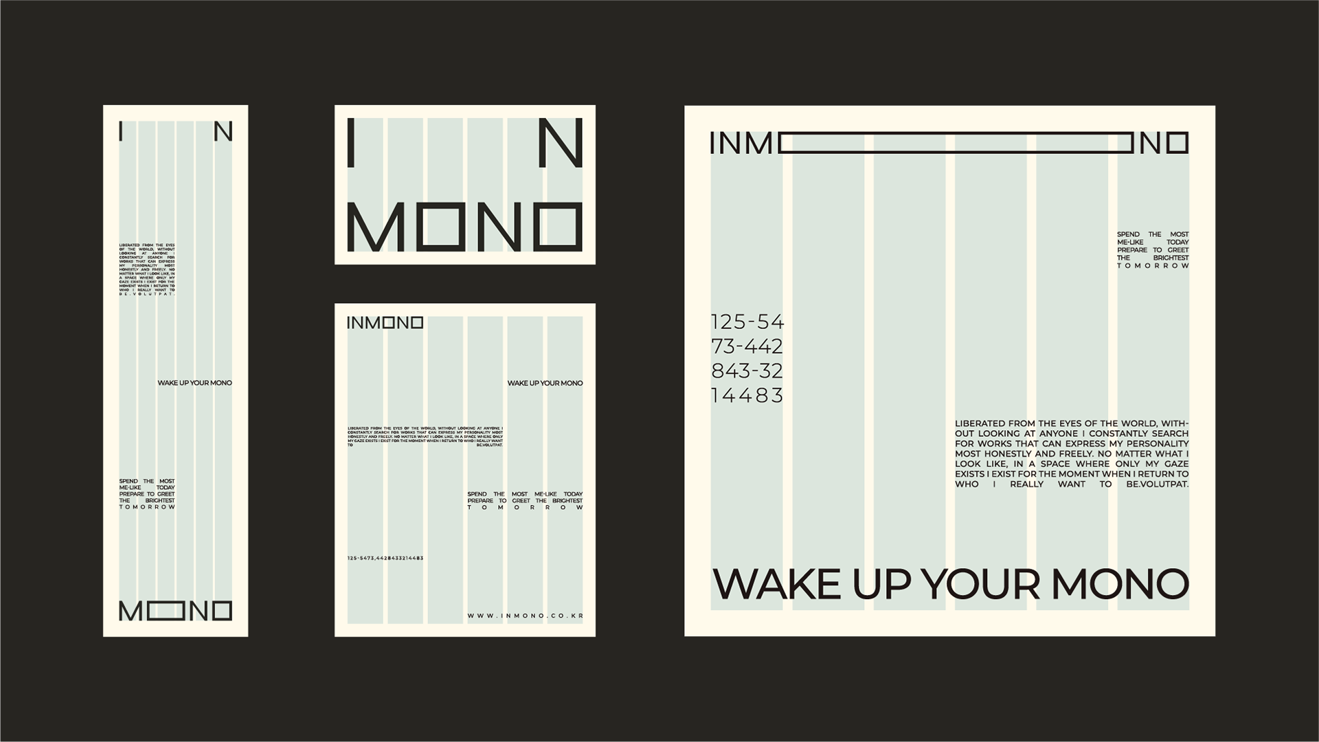
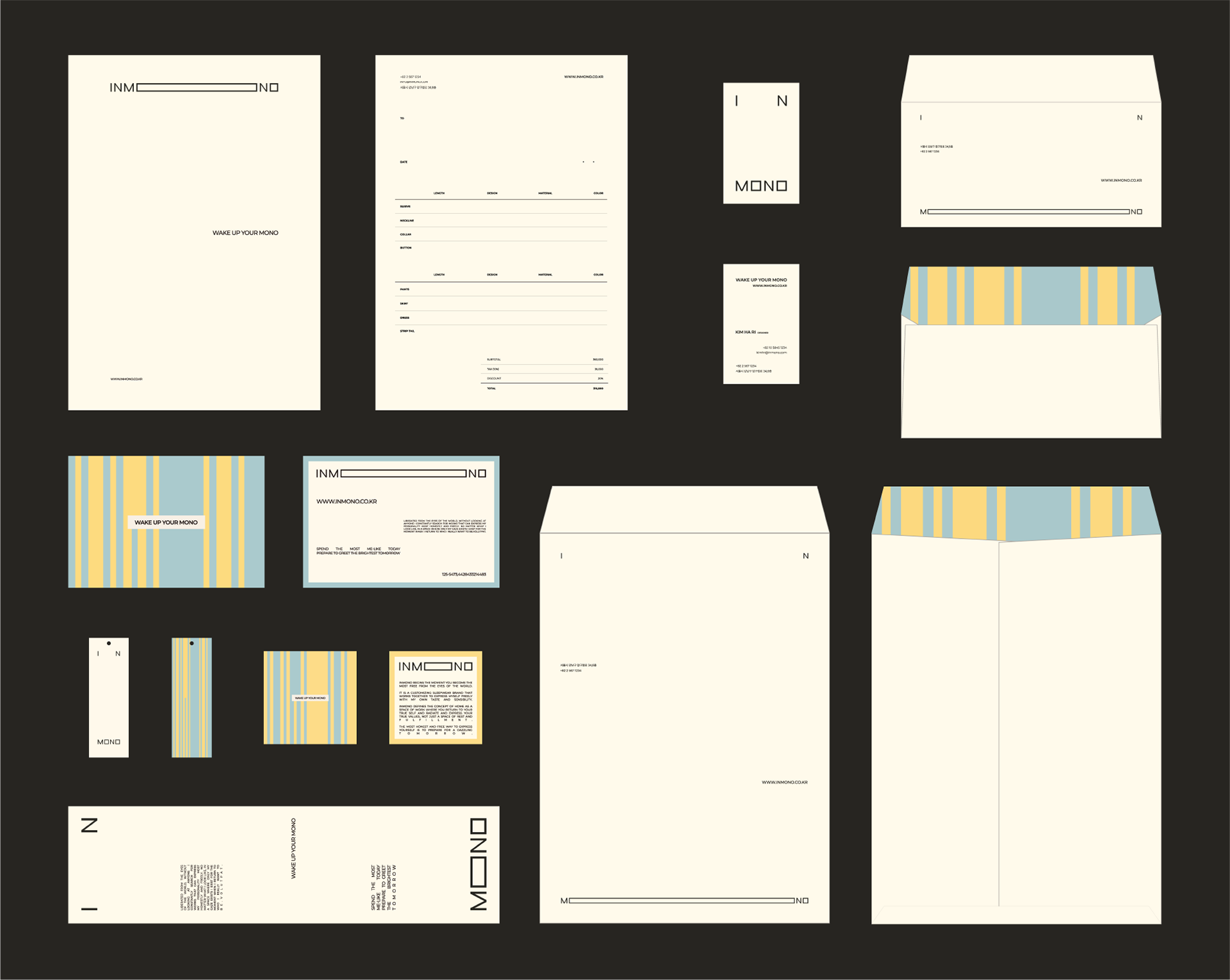
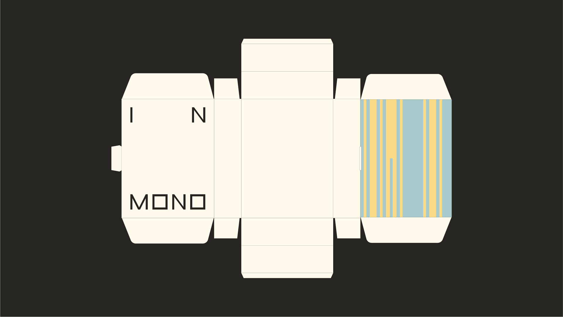
layout System
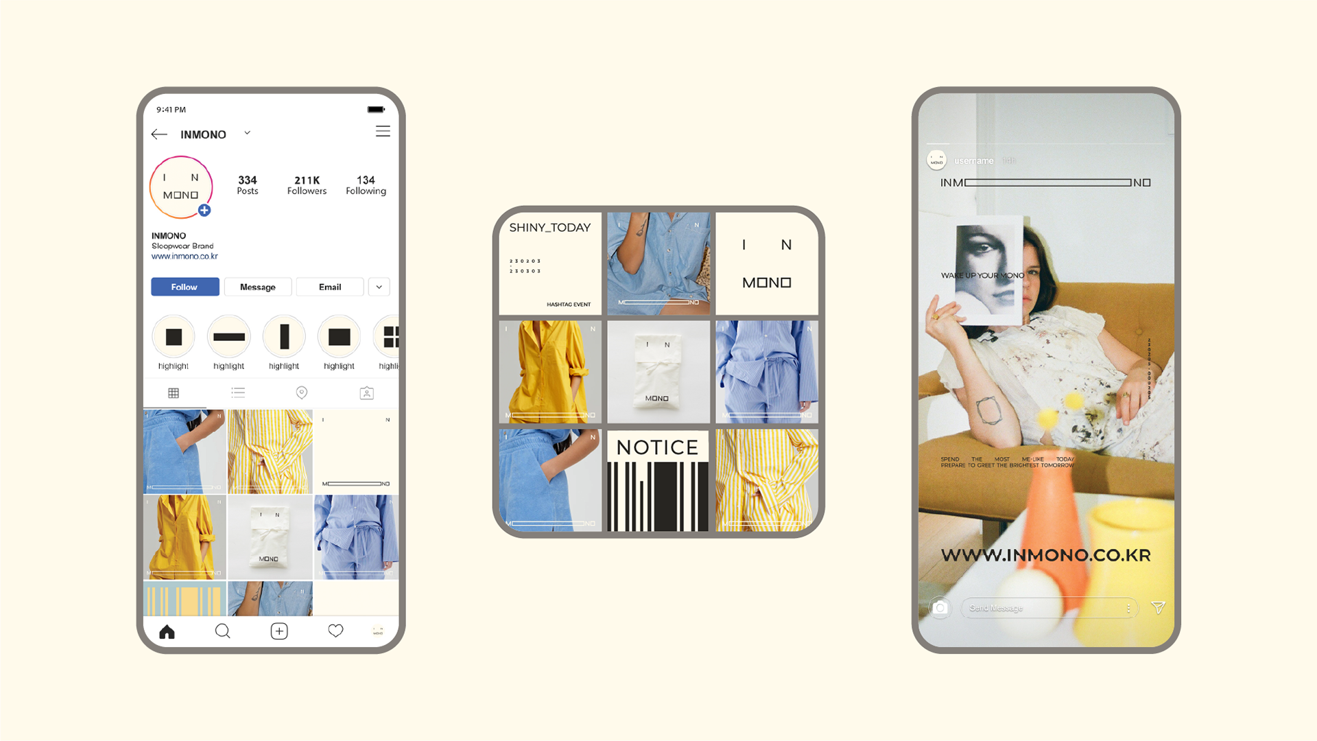
우리가 일상을 살아가는 공간 중심으로 각자의 취향을 배치하는 평면도에서 착안하여 레이아웃 시스템을 개발하였습니다. 각자의 공간을 채우듯 다양하게 변형되는 레이아웃 시스템으로 브랜드의 이야기를 담아냅니다.
Inspired by the floor plan that arranges each person's taste centered on the space in which we live our daily lives, It is a system that transforms in various ways as if filling each individual space, and captures the story of the brand.
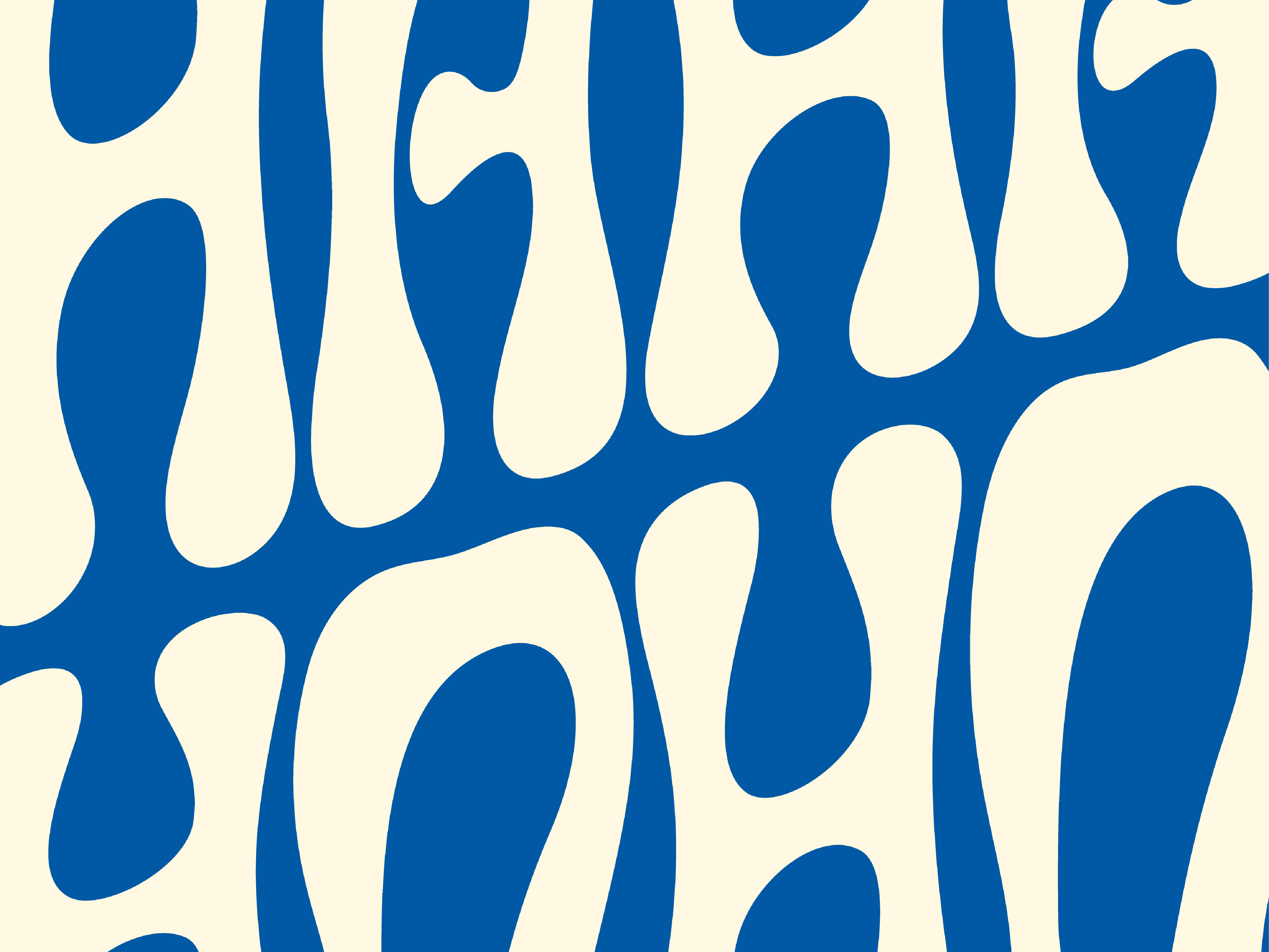
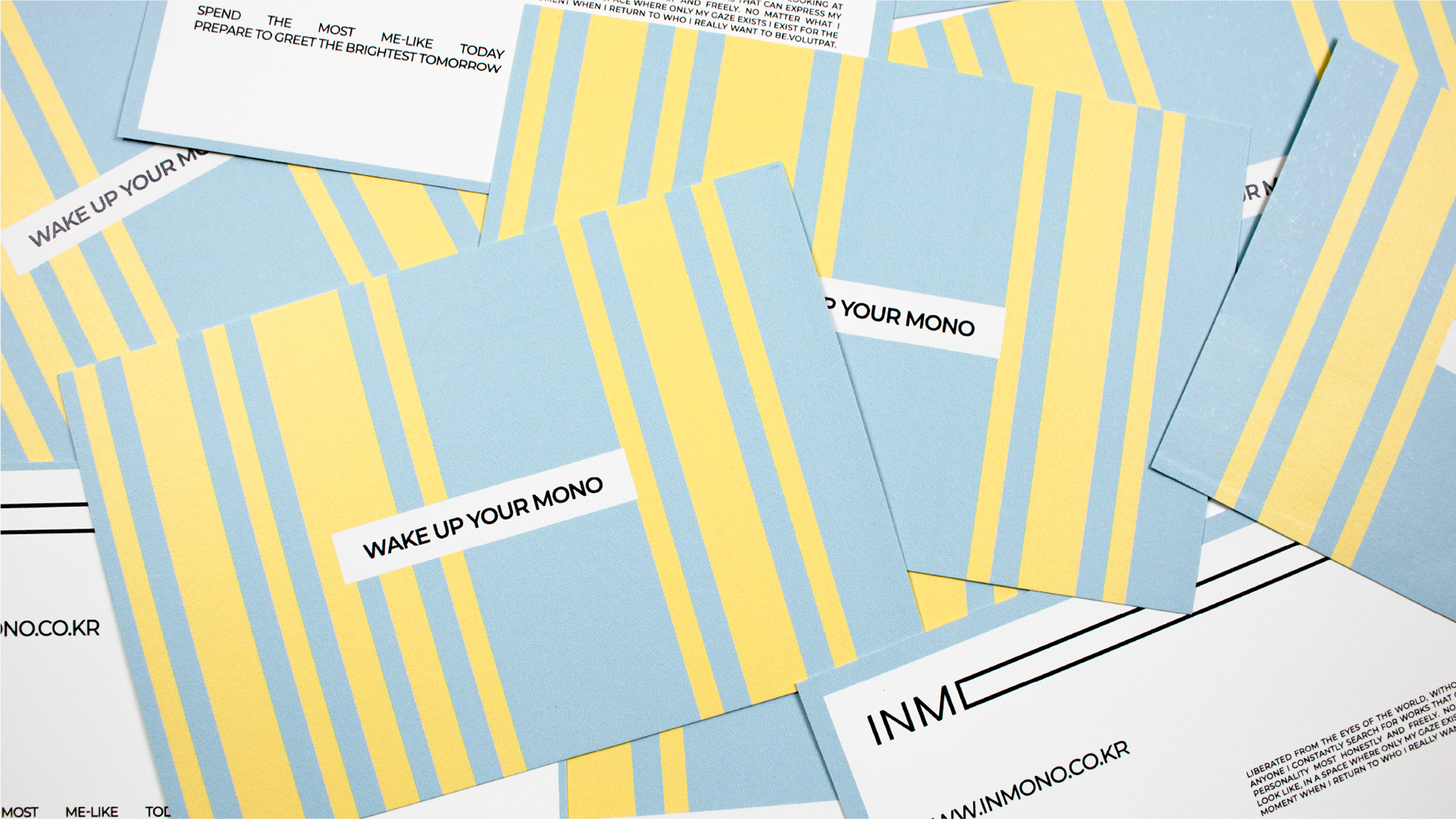
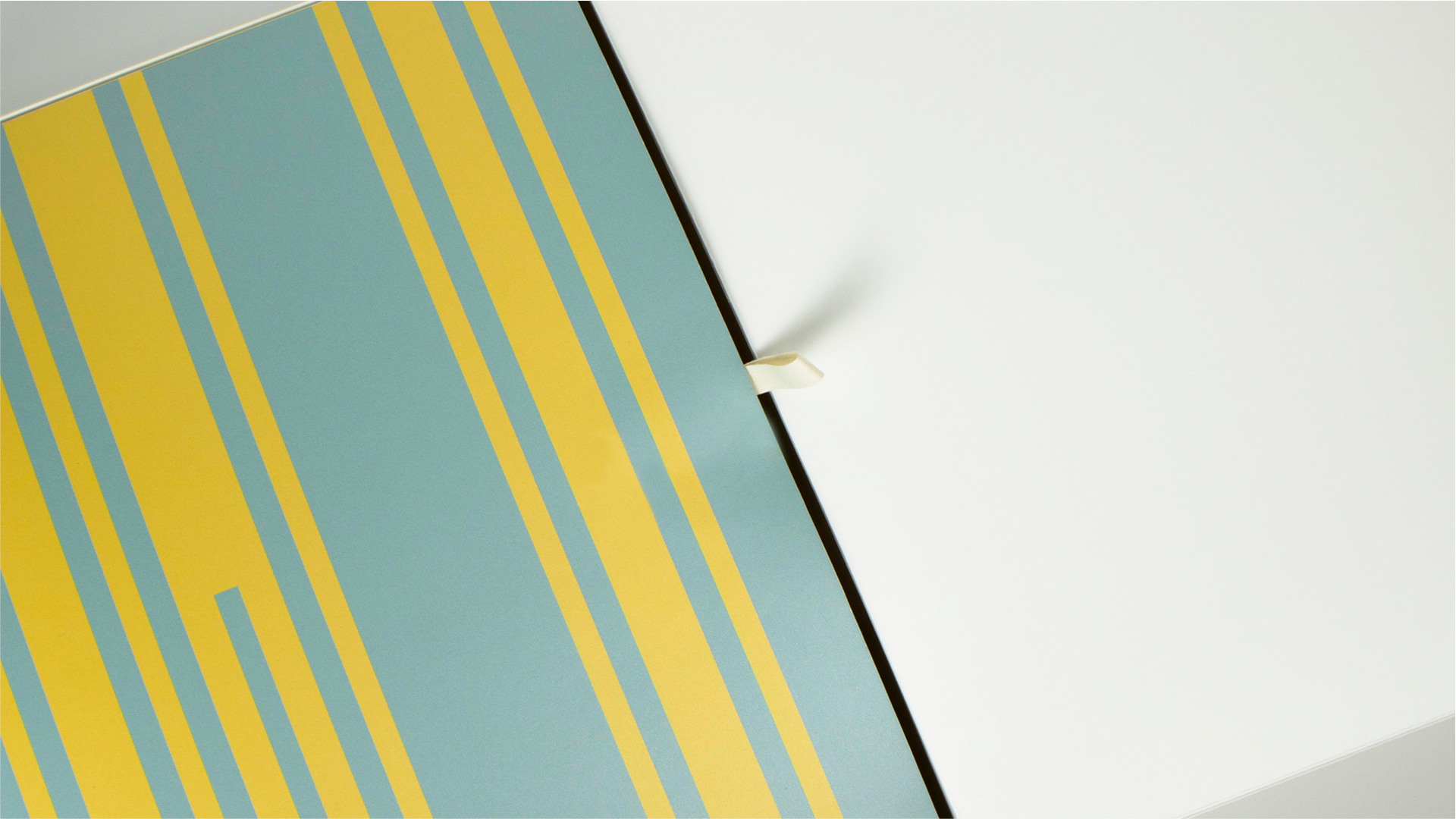
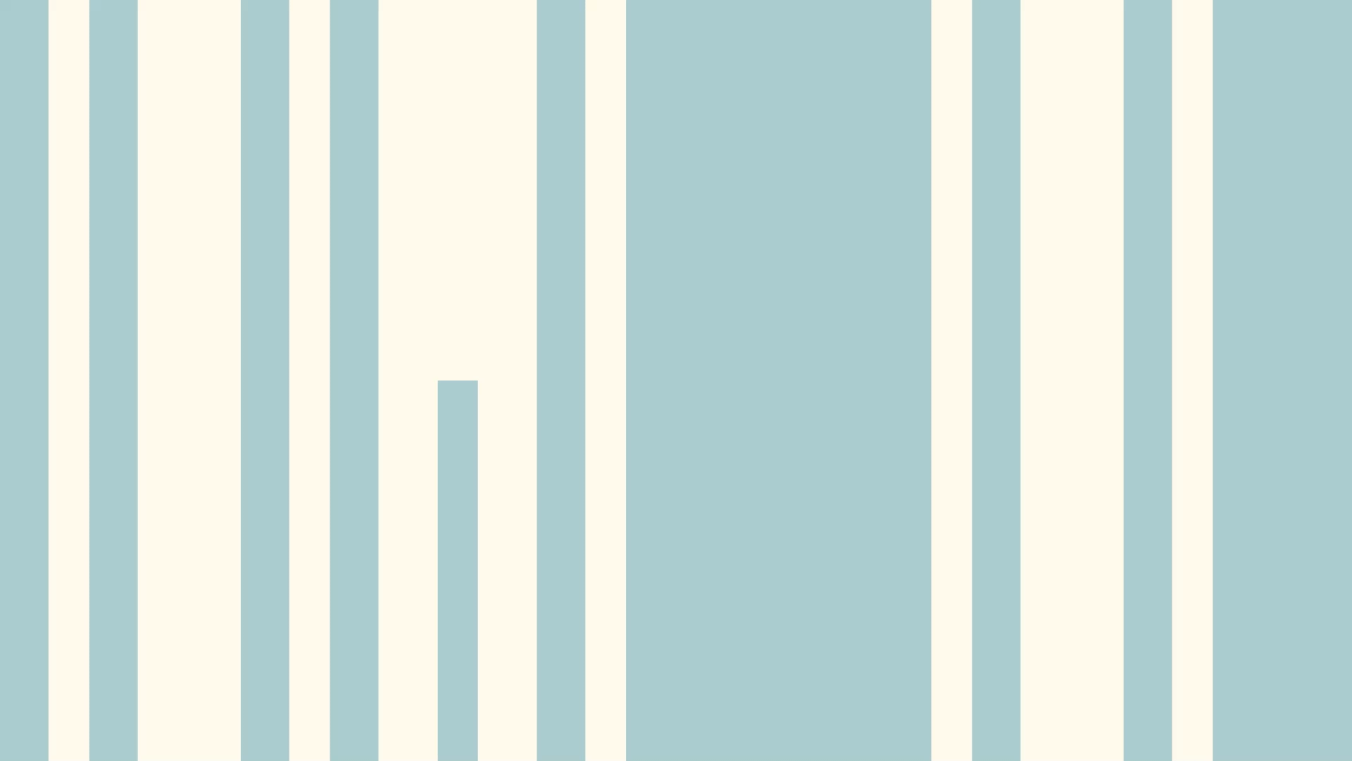
phatern motif
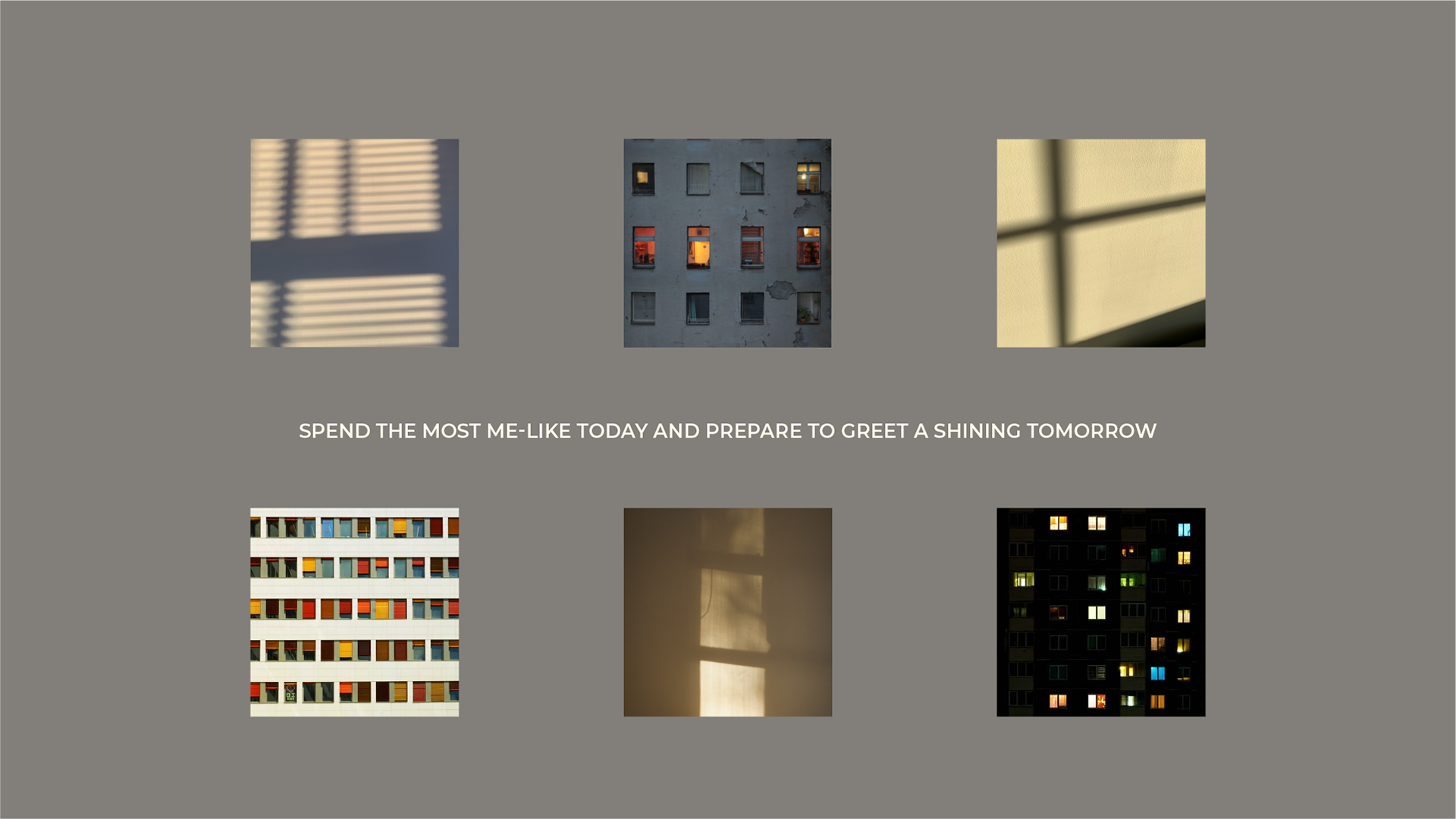
window that shines on me
INMONO의 패턴은 브랜드 로고를 중심으로 각 요소에서 뻗어져 나오는 컬러들을 활용해
창을 통해 오가는 빛의 경로를 시각화하여 어두운 밤 나만의 공간에서 자유롭게 발산하는 각자의 색과 이른 아침 나만의 공간으로 스며드는 맑은 햇살을 표현합니다.
이는 가장 나다운 오늘을 보내고 빛나는 내일을 맞이한다는 의미를 담았습니다.
창을 통해 오가는 빛의 경로를 시각화하여 어두운 밤 나만의 공간에서 자유롭게 발산하는 각자의 색과 이른 아침 나만의 공간으로 스며드는 맑은 햇살을 표현합니다.
이는 가장 나다운 오늘을 보내고 빛나는 내일을 맞이한다는 의미를 담았습니다.
The pattern of Inmono uses the colors extending from each element centering on the brand logo. By visualizing the path of light coming and going through the window, In the dark night, in my own space, each color freely radiates, It expresses the clear sunlight permeating into your own space in the early morning. It contains the meaning of having the most me-like today and welcoming a shining tomorrow.
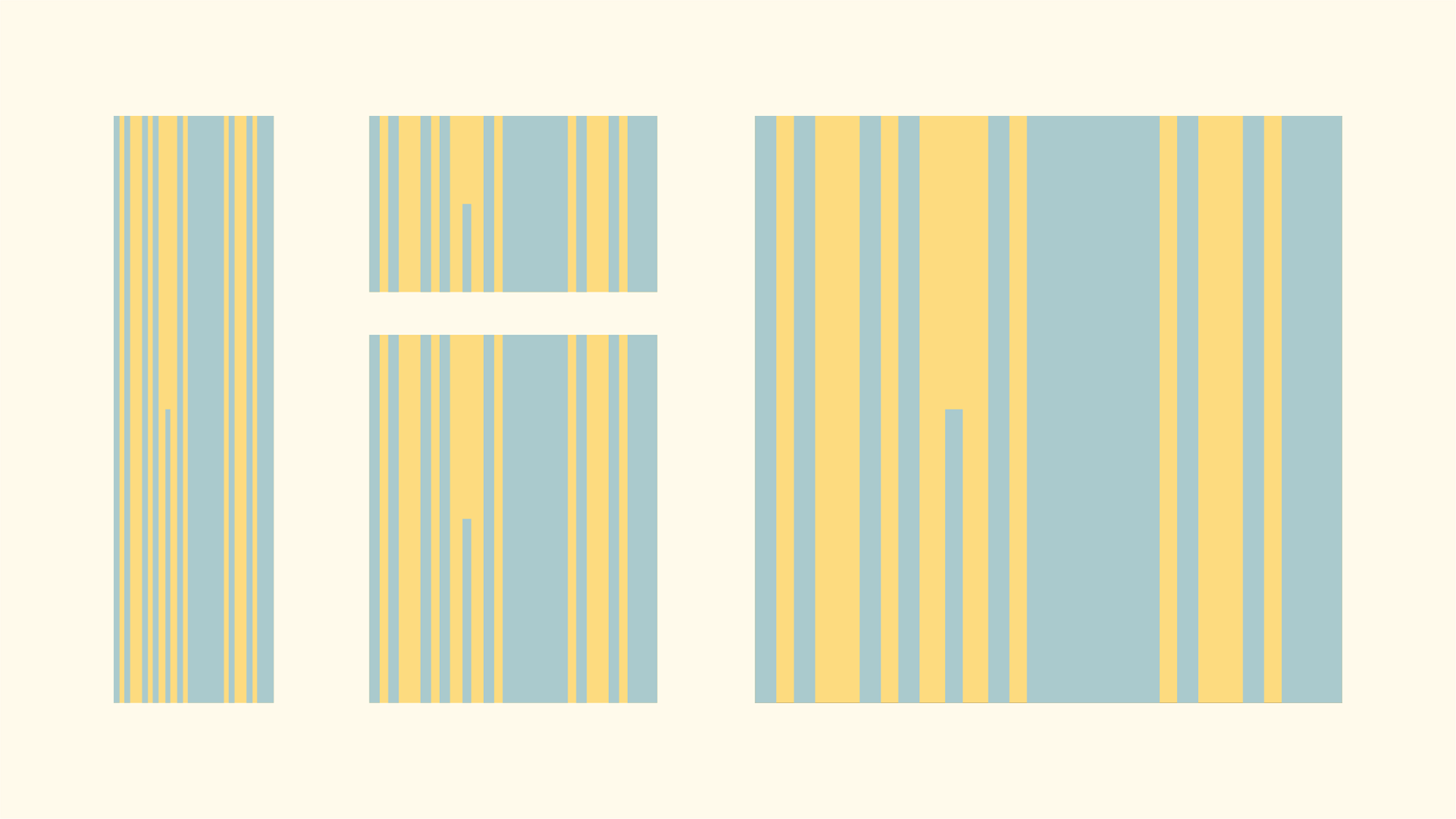
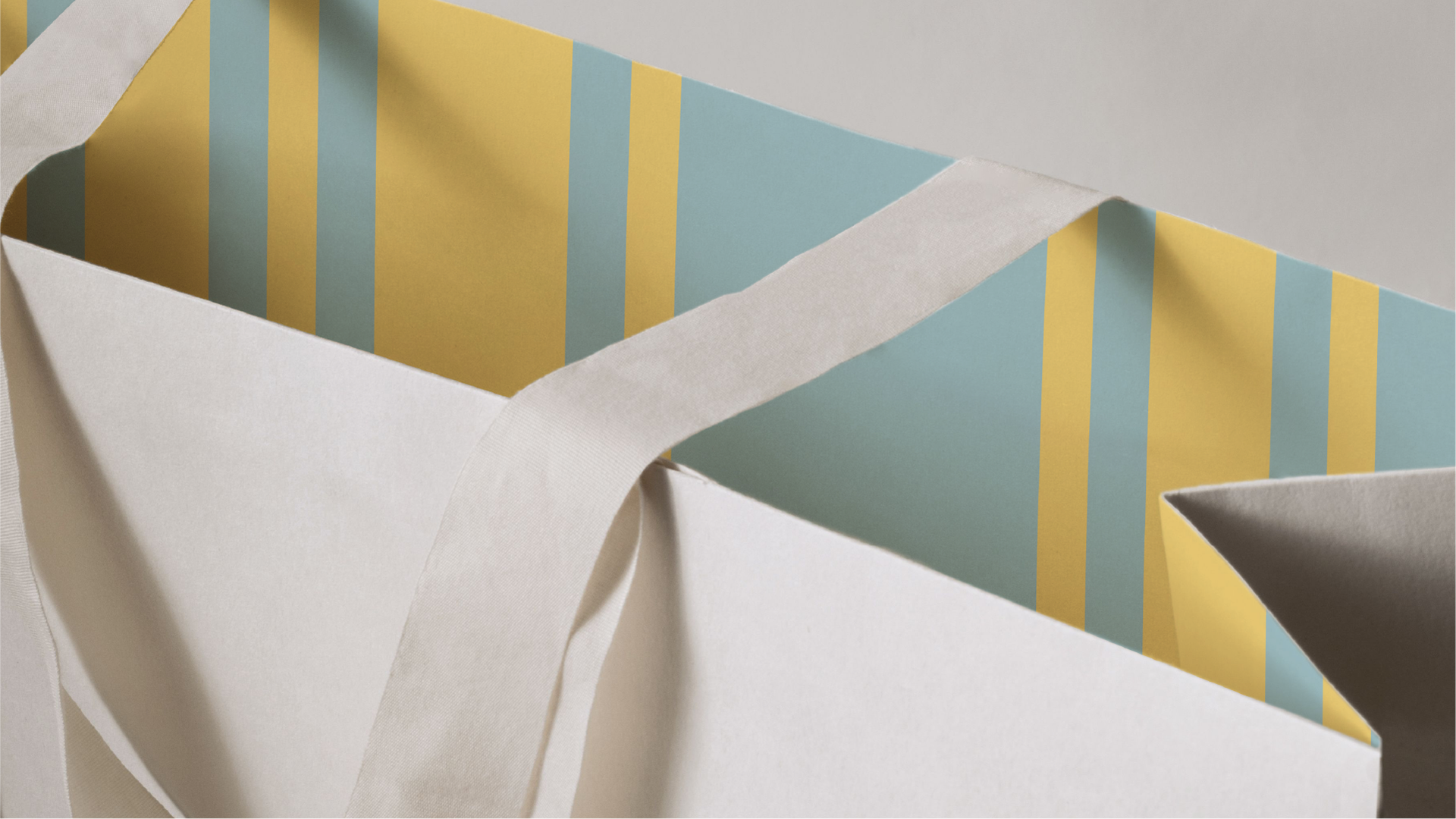
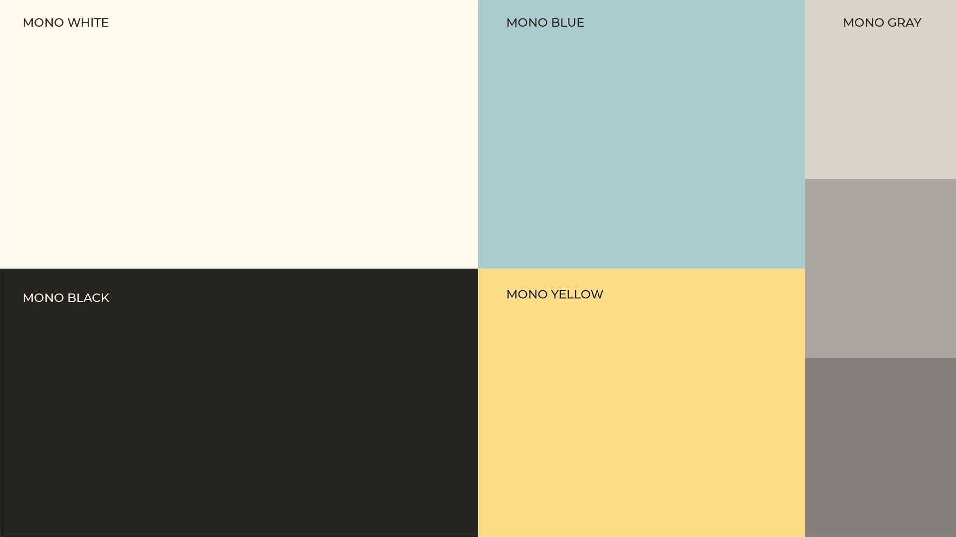
color system
INMONO의 메인 컬러 화이트와 블랙의 모노톤으로 일상을 함께하는 브랜드를 표현하고 창 밖으로 보이는 풍경과 창을 통해 들어오는 따스한 햇살을 떠올릴 수 있는 컬러를 사용하여 브랜드의 무드를 이끌어갑니다.
INMONO's main color white and black monotone expresses the brand that accompanies everyday life. We lead the mood of the brand by using colors that remind us of the scenery seen through the window and the warm sunlight.
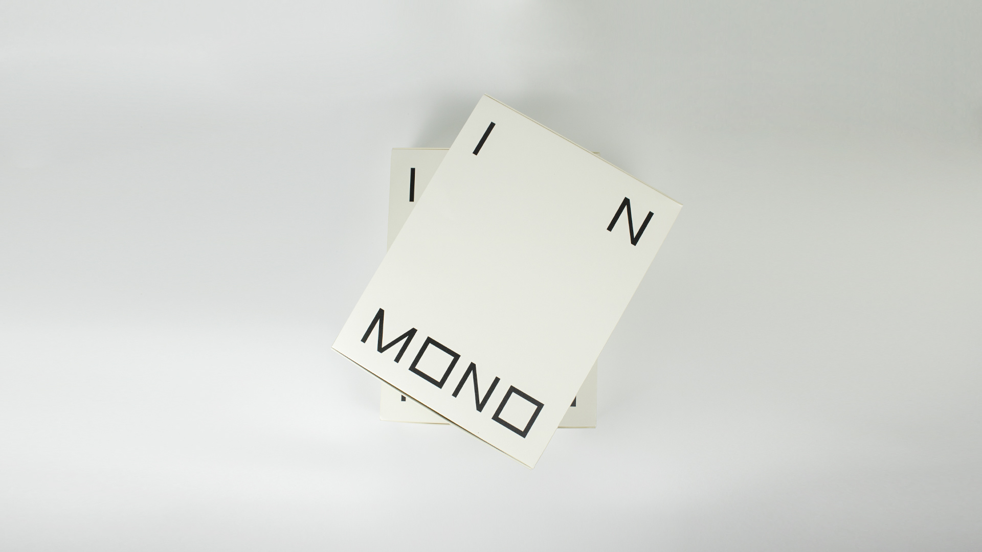
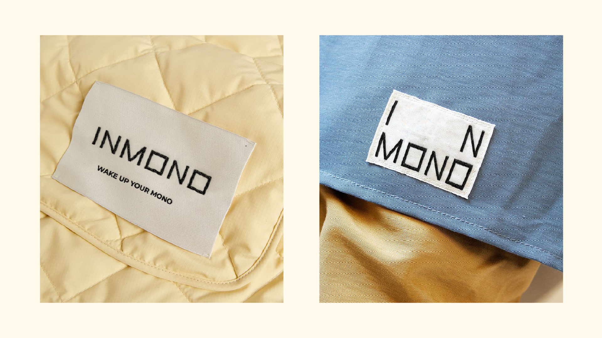
INMONO Brand Design
- Year : 2023
- Project Scope : Directing / Branding / Package
- Strategy & Design : Heeyoung Kim